import matplotlib
if not hasattr(matplotlib.RcParams, "_get"):
matplotlib.RcParams._get = dict.get
Periodicity and the sinusoidal model#
In this notebook, we’ll start by looking at the concept of periodicity and how this leads us to our first mathematical model of sound - the sinusoidal model. Hit the live code button (rocketship) in the top right corner to load all the packages, and carry on with the notebook!
A mathematical representation of sound#
One of the most fundamental models in audio signal processing which serves as a building block of many other types of sounds is the sinusoidal model. Mathematically, the sinusoidal model defined as
where \(A\) is the amplitude, \(f\) is the fundamental frequency (Hz), \(t\) is the time (seconds), and \(\theta\) is a phase offset (radians).
Let’s have a look at how the parameters affect the look and sound of this signal. Running the following cell brings up a number of sliders which correspond to the parameters, \(A\), \(f\), and \(\theta\). Play around with these to observe how the waveform changes visually and listen to the resulting sounds!
# Setting up the plots
fig, axes = plt.subplots(figsize=(6,3)) # you can change the figure size here, change (6,3) to something else
dt = 0.00001 # time spacing
t = np.arange(0,2,dt) # range of times to plot on x-axis
line, = axes.plot([], [], 'k')
axes.set_ylabel('Amplitude', color='k')
axes.set_xlabel('Time (s)', color='k')
axes.set_xlim([0, 0.01])
axes.set_ylim([-1, 1])
# Create the interactive plot
def update_sinusoid(A = 0.5, f=100, theta = 0):
y = A*np.cos(2*np.pi*f*t + theta)
line.set_data(t, y)
fig.canvas.draw_idle()
IPython.display.display(Audio(y.T, rate=1/dt,normalize=False))
print('Move the slider to see how the parameters change the sinusoid and listen to the result')
widgets.interact(update_sinusoid, A = (0.1,1,0.1), f = (30,2000,10), theta = (-4*np.pi,4*np.pi,np.pi/16));
plt.show()
plt.tight_layout()
Move the slider to see how the parameters change the sinusoid and listen to the result
Anti-clockwise circular rotations#
The first question that perhaps comes to mind is - how did we get to this mathematical model?
Well we need to start thinking about periodic signals - these are signals that have a repeating sequence of values at regular intervals. As sounds are the result of acoustic pressure oscillations, a periodic signal is the departure point for us to understand audio from a mathematical perspective. But before getting into mathematical descriptions of sound, let’s firstly imagine a periodic signal as an anti-clockwise rotation around a circle which sweeps out an angle (in degrees) between the positive x-axis (horizontal axis) and the line connecting the origin of the circle and the rotation point on the circle. We should expect that after \(360^{o}\), and every \(360^{o}\) after that, we would always end up in the exact same position of the circle that we started with at \(0^{o}\). Hence the angle of \(360^{o}\) is a regular interval for which the anti-clockwise circular motion repeats, indicative of a periodicity.
To visualize this, run the following cell and move the slider forward (you can also use your keyboard arrows) to rotate around the circle through larger angles. (There’s no need to immediately understand the code, but feel free to explore/modify if you are familiar with Python).
f = 1 # frequency in Hz
# Unit circle
xO,yO = (0,0) # origin
UnitCircle = patches.Circle((0.0, 0.0), radius=1,edgecolor="black",facecolor="none") # This is for plotting the unit circle
# Setting up figure
fig, ax = plt.subplots() # this sets up our figure environment. fig is a handle for the figure and ax is a handle for the axis
ax.add_patch(UnitCircle)
ax.plot(xO,yO,'k+')
ax.set_aspect('equal')
ax.grid(color='gray', alpha=0.01) # Grid lines
plt.gca().tick_params(axis='both', which='both', bottom=False, top=False, left=False, right=False, labelbottom=False, labelleft=False)
# Customize the color and transparency of the axes and grid lines
plt.gca().spines['top'].set_color('gray') # Top spine
plt.gca().spines['bottom'].set_color('gray') # Bottom spine
plt.gca().spines['left'].set_color('gray') # Left spine
plt.gca().spines['right'].set_color('gray') # Right spine
cn = ax.scatter([], []) # this command makes a scatter plot of x and y values
qc = ax.quiver(0, 0, angles='xy', scale_units='xy',scale=1) # quiver plots an arrow, where the values are the location of the arrows (see more here: https://matplotlib.org/2.0.2/api/pyplot_api.html)
qr = ax.quiver(0, 0, angles='xy', scale_units='xy',scale=1,color='blue') # quiver plots an arrow, where the values are the location of the arrows (see more here: https://matplotlib.org/2.0.2/api/pyplot_api.html)
qi = ax.quiver(0, 0, angles='xy', scale_units='xy',scale=1,color='orange') # quiver plots an arrow, where the values are the location of the arrows (see more here: https://matplotlib.org/2.0.2/api/pyplot_api.html)
# These commands are just decorations on the plot
ax.set_xlim([-1.1, 1.1]) # sets x and y limits of the plot
ax.set_ylim([-1.1, 1.1])
ax.grid('k', alpha=0.4) # turns on grid
# these commands make the axis pass through origin.
# set the x-spine
ax.spines['left'].set_position('zero')
# turn off the right spine/ticks
ax.spines['right'].set_color('none')
ax.yaxis.tick_left()
# set the y-spine
ax.spines['bottom'].set_position('zero')
ax.spines['top'].set_position('zero')
# Create the interactive plot
def update(angle = 0): # in the brackets here is the initial value of the variable you want to put on the slider
angle=angle/360
omega = 2*np.pi*f # Angular frequency (rad/s)
theta = omega*angle
x = np.cos(theta)
y = np.sin(theta)
# These update the plots
cn.set_offsets([x, y])
qc.set_UVC(x, y)
ax.set_title('Angle swept through = %1.0f$^{o}$' % (angle*360))
fig.canvas.draw_idle()
print('Move the slider to see how the plot changes as you change the angle (in degrees)')
widgets.interact(update, angle = (0,3*360,1)); # this creates the range for the slider. here time goes for 0 to 40s in intervals of 0.001s
Move the slider to see how the plot changes as you change the angle (in degrees)
Period and frequency#
In audio, we tend to use radians more frequently than degrees, and hence one full revolution around the circle would be \(2 \pi\) radians. We would now like to make a mathematical relationship so that at any time, \(t\) (seconds), we will be able to tell how much of an angle we have swept through (from the initial horizontal position along the positive x-axis).
Let us firstly define the fundamental period as the time it takes to sweep through \(2 \pi\) radians and denote it with the symbol T (with units of seconds). We can therefore express the relationship between an angle, \(\phi\), and time, \(t\), as: \begin{equation} \phi = 2 \pi \cdot \frac{ t}{T} \end{equation}
We can see that when \(t=T\), \(\phi = 2 \pi\), and when \(t\) is integer multiples of \(T\), so too will the angle, \(\phi\) be integer multiples of \(2 \pi\), starting back on the initial position of the circle for when \(\phi = 0\) radians.
We can also define the concept of frequency,\(f\), which is the number of periods per second:
with the unit of Hz (1/second). Hence we can also express the \(\phi\) in terms of frequency instead of the period:
where the quantity \(2 \pi f\) is referred to as the angular frequency (in radians) and often denoted as \(\omega\). We will encounter \(\omega\) extensively in the subsequent notebooks and put it aside for now.
But let’s make sense of all of this in the following interactive plot where you can change both the time, \(t\), and the period \(T\) (which in turn changes the frequency) and observe the anti-clockwise circular rotation.
# Unit circle
xO,yO = (0,0) # origin
UnitCircle = patches.Circle((0.0, 0.0), radius=1,edgecolor="black",facecolor="none") # This is for plotting the unit circle
# Setting up figure
fig, ax = plt.subplots() # this sets up our figure environment. fig is a handle for the figure and ax is a handle for the axis
ax.add_patch(UnitCircle)
ax.plot(xO,yO,'k+')
ax.set_aspect('equal')
ax.grid(color='gray', alpha=0.01) # Grid lines
plt.gca().tick_params(axis='both', which='both', bottom=False, top=False, left=False, right=False, labelbottom=False, labelleft=False)
# Customize the color and transparency of the axes and grid lines
plt.gca().spines['top'].set_color('gray') # Top spine
plt.gca().spines['bottom'].set_color('gray') # Bottom spine
plt.gca().spines['left'].set_color('gray') # Left spine
plt.gca().spines['right'].set_color('gray') # Right spine
cn = ax.scatter([], []) # this command makes a scatter plot of x and y values
qc = ax.quiver(0, 0, angles='xy', scale_units='xy',scale=1) # quiver plots an arrow, where the values are the location of the arrows (see more here: https://matplotlib.org/2.0.2/api/pyplot_api.html)
qr = ax.quiver(0, 0, angles='xy', scale_units='xy',scale=1,color='blue') # quiver plots an arrow, where the values are the location of the arrows (see more here: https://matplotlib.org/2.0.2/api/pyplot_api.html)
qi = ax.quiver(0, 0, angles='xy', scale_units='xy',scale=1,color='orange') # quiver plots an arrow, where the values are the location of the arrows (see more here: https://matplotlib.org/2.0.2/api/pyplot_api.html)
# These commands are just decorations on the plot
ax.set_xlim([-1.1, 1.1]) # sets x and y limits of the plot
ax.set_ylim([-1.1, 1.1])
ax.grid('k', alpha=0.4) # turns on grid
# these commands make the axis pass through origin.
# set the x-spine
ax.spines['left'].set_position('zero')
# turn off the right spine/ticks
ax.spines['right'].set_color('none')
ax.yaxis.tick_left()
# set the y-spine
ax.spines['bottom'].set_position('zero')
ax.spines['top'].set_position('zero')
# Create the interactive plot
def update(t = 0, T=5): # in the brackets here is the initial value of the variable you want to put on the slider
f = 1/T # frequency in Hz
omega = 2*np.pi*f # Angular frequency (rad/s)
theta = omega*t
x = np.cos(theta)
y = np.sin(theta)
# These update the plots
cn.set_offsets([x, y])
qc.set_UVC(x, y)
ax.set_title('T = '+str(np.round(T,decimals=3))+' seconds, f = '+str(np.round(f,decimals=3))+ ' Hz \n 2$\pi$ft = 2$\pi$'+str(np.round(f,decimals=3))+' x '+str(np.round(t,decimals=3)))
fig.canvas.draw_idle()
print('Move the slider to observe changes over time (seconds) and the period, T (seconds).')
widgets.interact(update, t = (0,10,0.001), T=(1, 10, 0.1)); # this creates the range for the slider. here time goes for 0 to 40s in intervals of 0.001s
Move the slider to observe changes over time (seconds) and the period, T (seconds).
Trigonometric relationships#
For any point in our anti-clockwise rotation around the circle, we can use basic trigonometry to decompose the line connecting the centre of the circle to the rotation point on the circle into a horizontal and vertical component, as shown in Fig. 1. For a circle of radius \(A\) and any angle \(\phi\):
the horizontal component will be \(A \cos \phi = A \cos (2 \pi f t)\)
the vertical component will be \(A \sin \phi = A \sin (2 \pi f t)\)
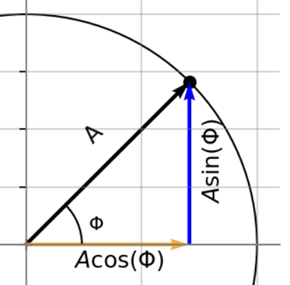
Fig. 1 - Cosine and Sine Decomposition.
Let’s focus on that horizontal component and see how it changes over time in the following plot.
# Horizontal component
# You can change this value and re-run the cell to see how things change as well.
T = 1
f = 1/T # frequency in Hz
# Unit circle
xO,yO = (0,0) # origin
UnitCircle = patches.Circle((0.0, 0.0), radius=1,edgecolor="black",facecolor="none") # This is for plotting the unit circle
# Setting up figure
fig, ax = plt.subplots() # this sets up our figure environment. fig is a handle for the figure and ax is a handle for the axis
ax.add_patch(UnitCircle)
ax.plot(xO,yO,'k+')
ax.set_aspect('equal')
ax.grid(color='gray', alpha=0.01) # Grid lines
plt.gca().tick_params(axis='both', which='both', bottom=False, top=False, left=False, right=False, labelbottom=False, labelleft=False)
# Customize the color and transparency of the axes and grid lines
plt.gca().spines['top'].set_color('gray') # Top spine
plt.gca().spines['bottom'].set_color('gray') # Bottom spine
plt.gca().spines['left'].set_color('gray') # Left spine
plt.gca().spines['right'].set_color('gray') # Right spine
cn = ax.scatter([], []) # this command makes a scatter plot of x and y values
qc = ax.quiver(0, 0, angles='xy', scale_units='xy',scale=1) # quiver plots an arrow, where the values are the location of the arrows (see more here: https://matplotlib.org/2.0.2/api/pyplot_api.html)
qr = ax.quiver(0, 0, angles='xy', scale_units='xy',scale=1,color='orange') # quiver plots an arrow, where the values are the location of the arrows (see more here: https://matplotlib.org/2.0.2/api/pyplot_api.html)
qi = ax.quiver(0, 0, angles='xy', scale_units='xy',scale=1,color='blue') # quiver plots an arrow, where the values are the location of the arrows (see more here: https://matplotlib.org/2.0.2/api/pyplot_api.html)
# These commands are just decorations on the plot
ax.set_xlim([-1.1, 1.1]) # sets x and y limits of the plot
ax.set_ylim([-1.1, 1.1])
ax.grid('k', alpha=0.4) # turns on grid
# these commands make the axis pass through origin.
# set the x-spine
ax.spines['left'].set_position('zero')
# turn off the right spine/ticks
ax.spines['right'].set_color('none')
ax.yaxis.tick_left()
# set the y-spine
ax.spines['bottom'].set_position('zero')
ax.spines['top'].set_position('zero')
# Create the interactive plot
def update(t = 0): # in the brackets here is the initial value of the variable you want to put on the slider
omega = 2*np.pi*f # Angular frequency (rad/s)
theta = omega*t
x = np.cos(theta)
y = np.sin(theta)
# These update the plots
cn.set_offsets([x, y])
qc.set_UVC(x, y)
qr.set_UVC(x, 0)
ax.set_title('T = '+str(T)+' seconds, f = '+str(f)+ ' Hz \n 2$\pi$ft = 2$\pi$'+str(f)+' x '+str(np.round(t,decimals=3)))
fig.canvas.draw_idle()
print('Move the slider to observe changes over time (seconds)')
widgets.interact(update, t = (0,3,0.001)); # this creates the range for the slider. here time goes for 0 to 40s in intervals of 0.001s
Move the slider to observe changes over time (seconds)
Connecting the circle to a signal#
What we can observe is that over time, this horizontal component is oscillating back and forth around the centre of the circle. What if we were to imagine the tip of the horizontal component as an amplitude of a signal, \(A\), and plot that point vs time? What we would be doing is essentially plotting the signal:
which we know is periodic with period, \(T\) seconds, and frequency \(f = 1/T\) Hz.
Run the following animation to see this. In the code, you can change the frequency, \(f\) on the first line and re-run the cell to see how the animation changes (for visualization, it’s best to change \(f\) within the range \(0.5\) to \(5\) Hz). The animation will take a few seconds to generate.
f = 1 # frequency (Hz) !!! Change this to see how things vary !!!
theta = 0 # phase shift in radians (read the cell below and then return to change this to a value between 0 and 2pi to see how things vary)
omega_o = 2*np.pi*f # angular frequency
T = np.abs((2*np.pi)/omega_o) # period (we use the absolute value in case the freq. is negative)
Np = 2 # number of periods
dt = 0.01
t = np.arange(0,2,dt) # time
N_frames = int(np.round(2/dt))
xcos = np.cos(omega_o*t + theta)
ysin = np.sin(omega_o*t + theta)
# Unit circle
xO,yO = (0,0) # origin
UnitCircle = patches.Circle((0.0, 0.0), radius=1,edgecolor="black",facecolor="none")
# SEtting up plots,
fig, axes = plt.subplots(1,2,figsize=(10,4))
axes[0].add_patch(UnitCircle)
axes[0].plot(xO,yO,'k+')
line_mainstem, = axes[0].plot([], [], 'k--',lw=1)
line_mainpt, = axes[0].plot([], [], 'g-o',lw=1)
line_mainstem_cos, = axes[0].plot([], [], 'orange',lw=1)
line_mainpt_cos, = axes[0].plot([], [], 'orange',marker='d',lw=1)
# time_text = axes[0].text(0.02, 0.95, '', transform=ax1.transAxes)
axes[0].set_title('$f$ = '+str(f)+'Hz, $\omega$ = $2 \pi$'+str(f))
axes[0].grid(color='lightgrey',alpha=0.4)
axes[0].set_aspect('equal')
line_cos, = axes[1].plot([], [], 'orange',lw=1)
line_cospt, = axes[1].plot([], [], 'orange',marker='d',lw=1)
axes[1].set_xlabel('Time [s]')
axes[1].set_ylabel('Amplitude')
axes[1].set_xlim(0,2)
axes[1].set_ylim(-1,1)
axes[1].set_aspect('equal')
axes[1].set_title('$Period, T = 1/f$ = '+str(T)+'s')
axes[1].grid(color='lightgrey',alpha=0.4)
axes[1].axhline(y=0, color='lightgrey',alpha=0.8)
connector = Line2D([xcos[0],0],[0,xcos[0]], transform=fig.transFigure, color='orange', linestyle='--', alpha=0.3)
fig.add_artist(connector)
def animate(i): # animate is in the matplotlib library that can do animations. i is a running index over which you update, in this case it is time.
x = xcos[i]
y = ysin[i]
line_mainstem.set_data([xO, x],[yO, y])
line_mainpt.set_data([x,x],[y,y])
line_mainstem_cos.set_data([xO, x],[0, 0])
line_mainpt_cos.set_data([x,x],[0,0])
# cosine waves
line_cos.set_data(t[0:i+1],xcos[0:i+1])
line_cospt.set_data([t[i],t[i]],[x,x])
# dotted line
# left endpoint in axes[0] data coords
left_disp = axes[0].transData.transform((x, 0)) # display (px)
left_fig = fig.transFigure.inverted().transform(left_disp) # figure (0..1)
# # right endpoint in axes[1] data coords
right_disp = axes[1].transData.transform((t[i], x))
right_fig = fig.transFigure.inverted().transform(right_disp)
connector.set_data([left_fig[0], right_fig[0]], [left_fig[1], right_fig[1]])
return line_mainstem,line_mainpt, line_mainstem_cos, line_mainpt_cos, line_cos, line_cospt, connector
anim = animation.FuncAnimation(fig, animate, frames=N_frames, interval=40, blit=True) # this calls the function to do the animation
plt.close(fig)
HTML(controls_css + anim.to_jshtml())